GearUI Kit
A Kotlin Multiplatform UI component library built on Kuikly. Write a screen once in commonMain; it renders natively on Android and iOS and through the DOM on the Web.



At a glance
commonMain.dependencies {
    implementation("com.gearui:gearui-kit:1.0.0-beta6")
}- 71 components in 6 categories — every one has a demo page in the sample app
- Design tokens with teeth — colour, radius, elevation, spacing, border and icon size are named scales; CI rejects hardcoded literals in component code
- Runtime included —
Approot wires theme, i18n, overlay host and a stabilised safe-area pipeline in one call - i18n built in — language packs resolved from a BCP 47 tag, domain-split so no class hits Android's DEX limits, and downstream libraries plug into the same pipeline
- Android · iOS · Web · HarmonyOS — one
commonMain; HarmonyOS builds through a parallel configuration and is not yet verified on a device
How it compares
Nobody has heard of GearUI Kit. Everybody has shipped with at least one of the columns to its right, so the honest way to say what this stack is good at is to put it beside them. Each row is a real difference. ✅ marks where this stack is clearly ahead; the last row is where it is clearly behind. The full comparison has the reasoning, the pain points each layer removes, the tooling story, and a source for every number.
| GearUI Kit + KuiklyUI + KMP | Plain KMP (Compose MP) | Flutter | React Native | |
|---|---|---|---|---|
| Rendering | ✅ Real native views, everywhere | Native on Android; canvas on iOS | Its own engine, canvas everywhere | Real native views |
| Native controls — IME, autofill, accessibility, text selection | ✅ The system's own | Reimplemented on iOS | Reimplemented; a native view must be embedded | The system's own |
| Follows OS design updates (iOS 26) | ✅ The day the OS ships | Waits for a repaint on iOS | Waits for the framework to repaint | The day the OS ships |
| Performance | ✅ First screen 122 ms vs native 125 ms · SDK 300 KB / 1.2 MB ¹ | Skiko | Engine, MB-scale | JS engine + bundle |
| Platform debugging tools | ✅ Every view visible and attributable; on Android, the native ceiling | Visible on Android, opaque on iOS | Opaque FlutterView; DevTools only | Visible; two stacks to correlate |
| Language | Kotlin, shared with the Android team and a JVM backend | Kotlin | Dart | JS / TS |
| Default look | ✅ HeroUI Native floor + iOS 26 platform controls, 71 components | Material 3 | Material; Cupertino is second-class | None |
| Design consistency | ✅ Tokens enforced by 22 CI checks | None | Themeable, not enforced | None |
| HarmonyOS | ✅ First-class target | No | Community fork | Huawei-maintained fork |
| Ecosystem and maturity | Small · beta6 (KuiklyUI runs Tencent products at 500 M DAU) | Medium | Large · since 2017 | Very large · since 2015 |
¹ Tencent's own measurement on HarmonyOS, Huawei Mate 60, complex feed scenario — source. SDK sizes from the KuiklyUI README.
Screenshots
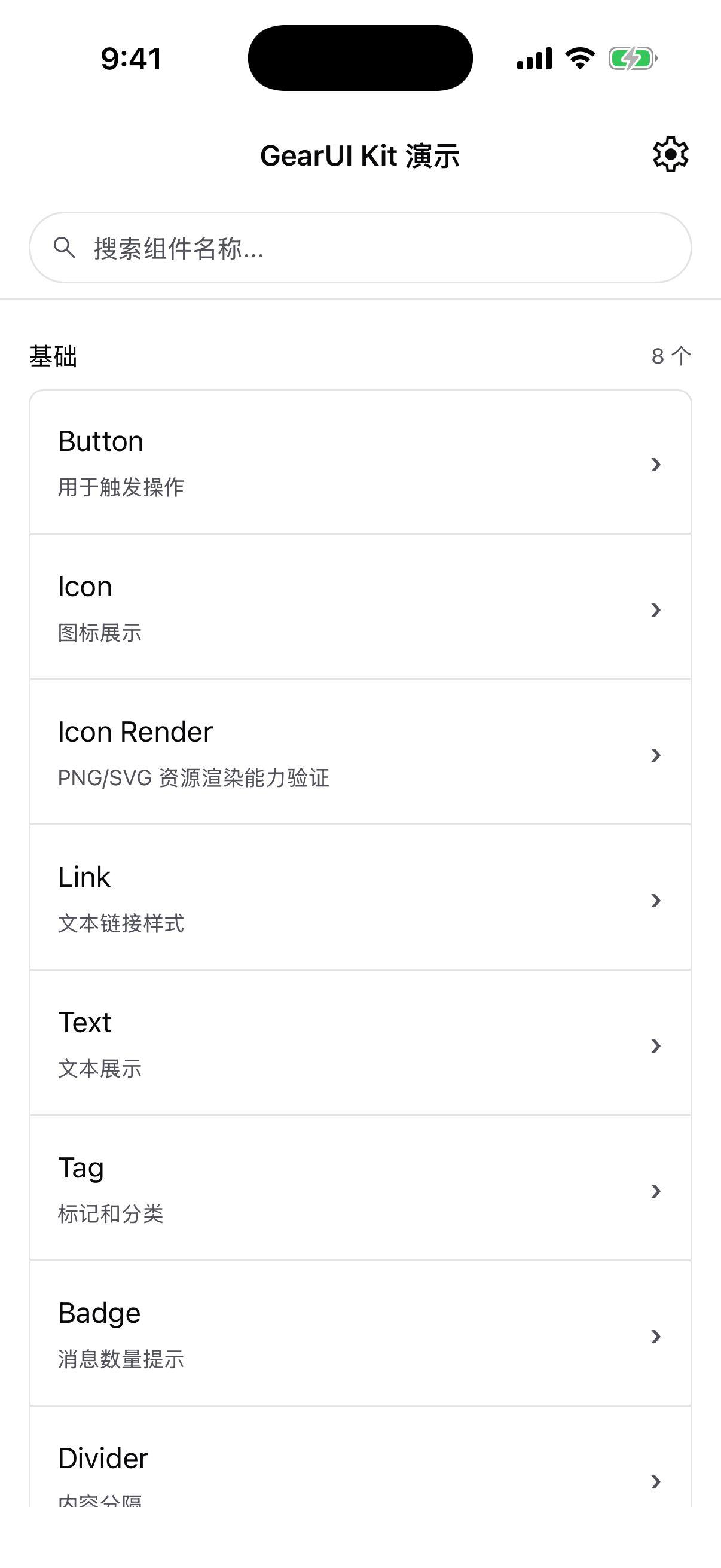
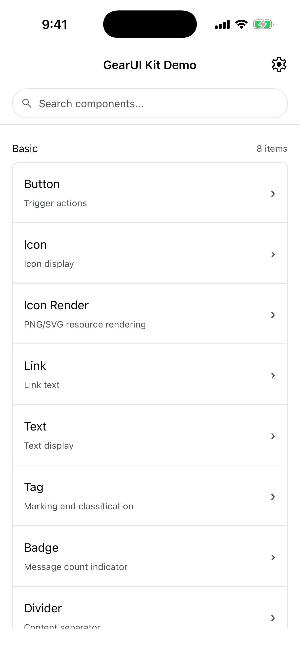
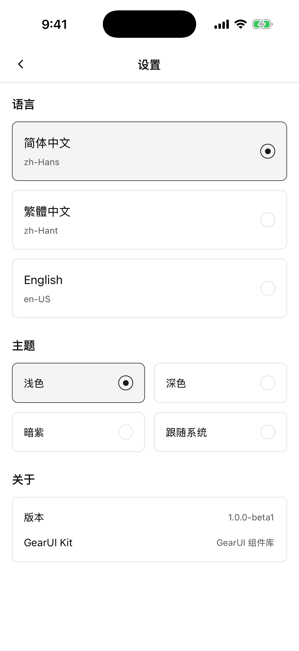
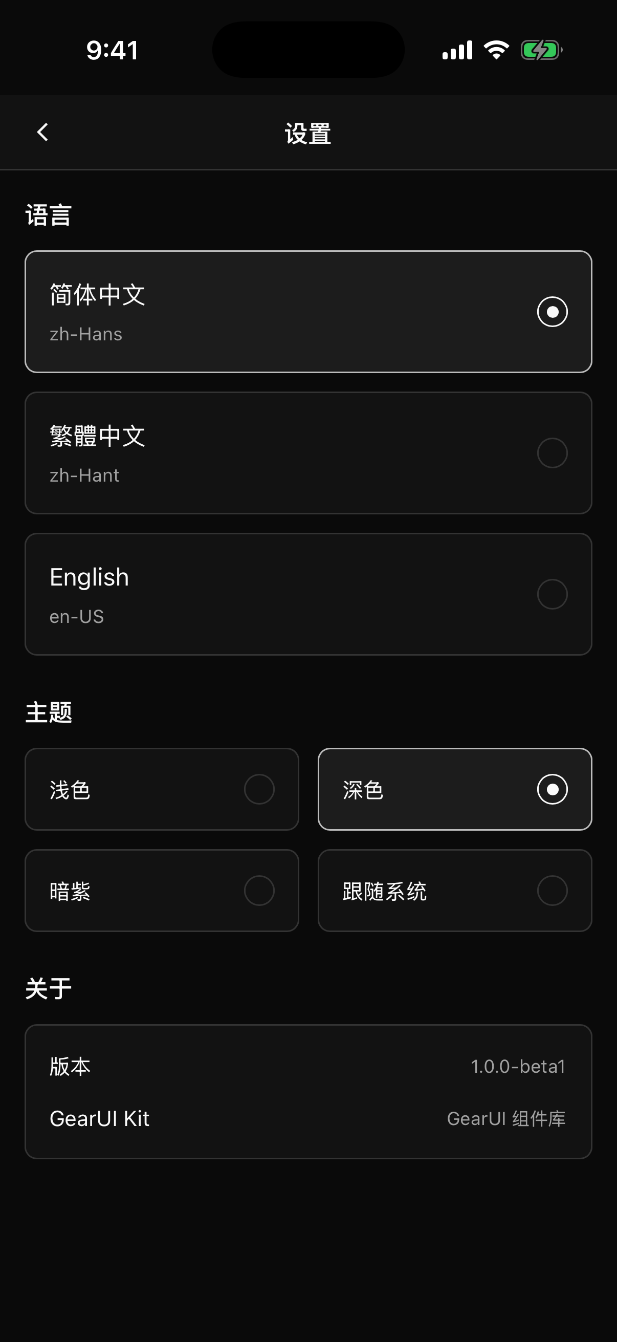
Captured from the sample app on an iPhone 17 Pro Max simulator (iOS 26.2). Language and theme are switched at runtime from the settings page; every component follows.
Why it exists
Compose Multiplatform gives you one language for UI. It does not give you a component library that looks like a finished product on day one, or a design system that stays consistent once ten people are committing. GearUI Kit is the layer above the renderer: the components, the tokens, the runtime plumbing (overlays, safe area, keyboard, i18n) and the CI guardrails that keep all of it from drifting.
It is used in production by PrivChat's shared UI layer, which is where most of the components were shaped.
Where to go next
- Getting started — add the dependency and mount the
Approot - Platforms — what is verified on each target
- Theming & tokens — the six scales and how to read them
- Components — the full index